01.
RedesigningSpinny'shomepageforcommittedbuyers
After booking a test drive, users returned to the exact same homepage as a first-time visitor. No booking detail. No next step. No acknowledgement they'd said yes. The homepage was losing people it had already won.
The problem
A returning buyer with a test drive booked landed on the same homepage as a first-time visitor. The product had the data. The page never looked at it.


02.
Problem
Two users. One homepage.
A product blind to the difference.
Spinny's homepage was designed for discovery, browsing, filtering, comparing. It served exploratory users well. But a large cohort of returning users had already committed. They'd scheduled a test drive, made a booking, or were waiting on delivery. For them, the homepage showed nothing relevant.
“A user who just booked a test drive returns to the app and sees the same homepage as someone who has never heard of Spinny.”
| The browser | The BuyerThe Gap | |
|---|---|---|
| STATE | Browsing inventory. No commitment yet. | Test drive booked. Returning for next step. |
| GOAL | Find the right car | What do I do now? |
| HOMEPAGE FIT | Works perfectly, built for this user | Shows nothing relevant. Booking invisible. |
| INTENT | Exploratory · low commitment | Highest intent · completely ignored |
Two cohorts, one homepage, committed buyers were invisible to the product.
Drop-offs peaked in the 48-hour gap between scheduling and showroom visit. The data pointed to a continuity problem, not a UI problem.
03.
Wherethejourneybrokedown
I mapped the transactional lifecycle to locate exactly where committed users were being dropped. The friction wasn't in booking, it was in the void immediately after.
Average gap between when test drive was scheduled to when the user would visit the Hub for the test drive spot. In the entire time window there is no affordance to the upcoming task or updates on the user action, which then was shown in data as Peak drop off point.
User lifecycle mapped across four stages, the 48-hour void between Test Drive Scheduled and Showroom Visit had zero product support.
Every stage after scheduling depended on the user remembering what to do next without the product telling them. That's not a feature gap, that's a trust gap.
04.
Nobodyhadsolvedthis.
Before designing, I audited how competitors handle returning committed users. The finding shaped the framing of the opportunity.
| Platform | Post-booking homepage | State awareness | Verdict |
|---|---|---|---|
Cars 24 Indian Market | Dashboard widget with delivery tracker but only visible when logged in. | ConditionalAnonymousUsers sees nothing | Partial |
Car Dekho Indian Market | Generic inventory homepage. Identical to a first visit. No booking state. | None | None |
CarWale Indian Market | Category filters and listings. Transactional intent invisible to the interface. | None | None |
Indian Market | The homepage tends to have a Phoenix Experience which enables a user with scarce and surface level information. This enables in low confidence and reduces the decision velocity. | NoneCommitted users are invisible | Gap |
Competitive audit across four Indian used-car platforms, none surface post-booking state on the homepage.
No platform in the Indian used-car market surfaces booking state on the homepage for returning committed users. The gap isn't unique to Spinny, but that makes it an opportunity, not an excuse.
05.
Howmightweguidecommittedbuyers?
Reframing the hypothesis from a system description to a user experience changed how the team thought about the solution space.
06.
Workingwithintherealworld
Four constraints shaped what was possible before any exploration began. Understanding them early meant the solution didn't get killed in engineering review.
07.
Twopaths.Onerightanswer
I explored two structurally distinct approaches. The goal wasn't the most ambitious solution, it was the one that solved the problem without creating new ones.
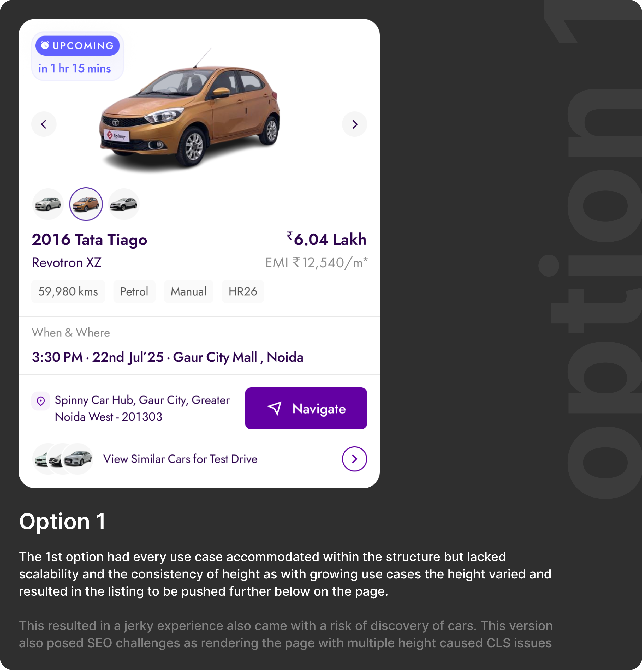
Option A, Inline banner: a contextual strip above inventory. Lower disruption, limited information density.
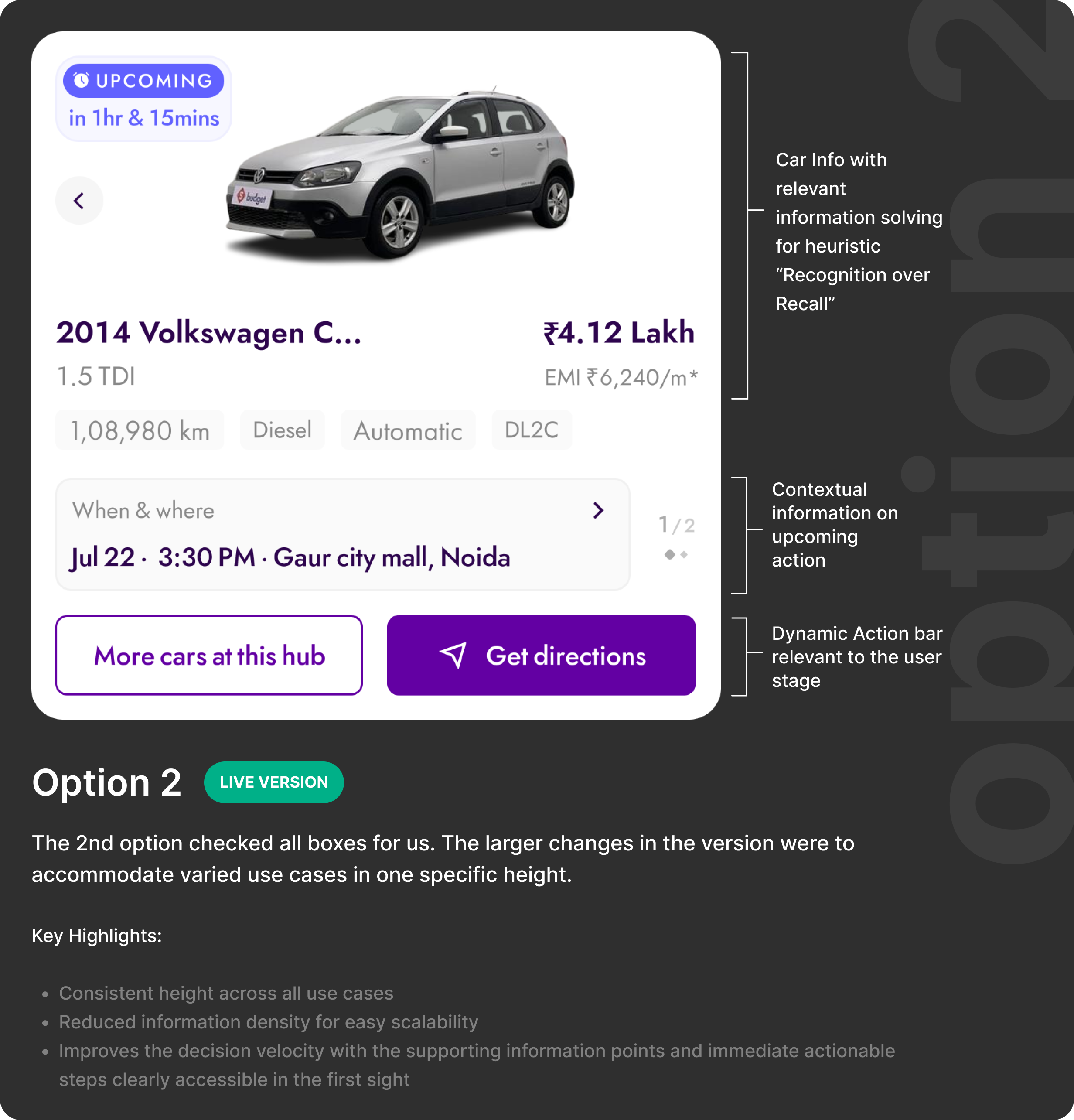
Option B, State-aware homepage mode: the page reconfigures based on transaction stage. Chosen direction.
We also explored a dedicated transaction dashboard and a snappable swipe interaction, both deprioritised due to ownership conflicts and performance constraints. The right answer was clarity, not novelty.
08.
FinalDesigns
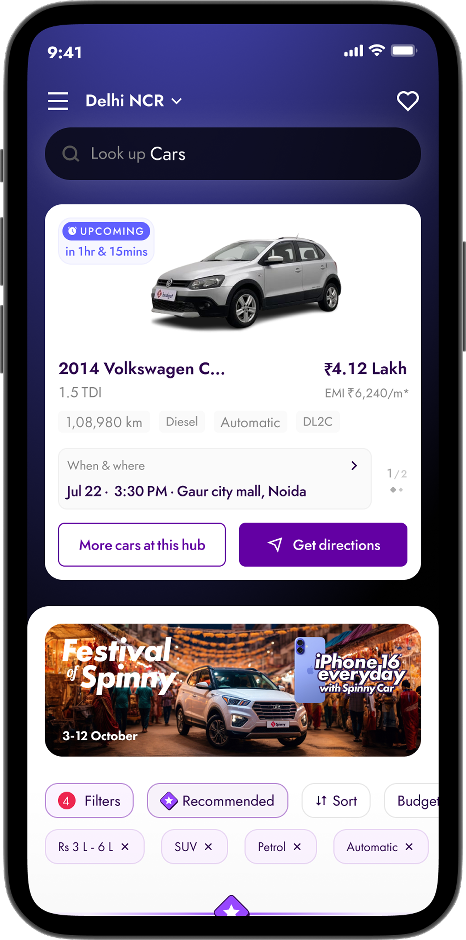
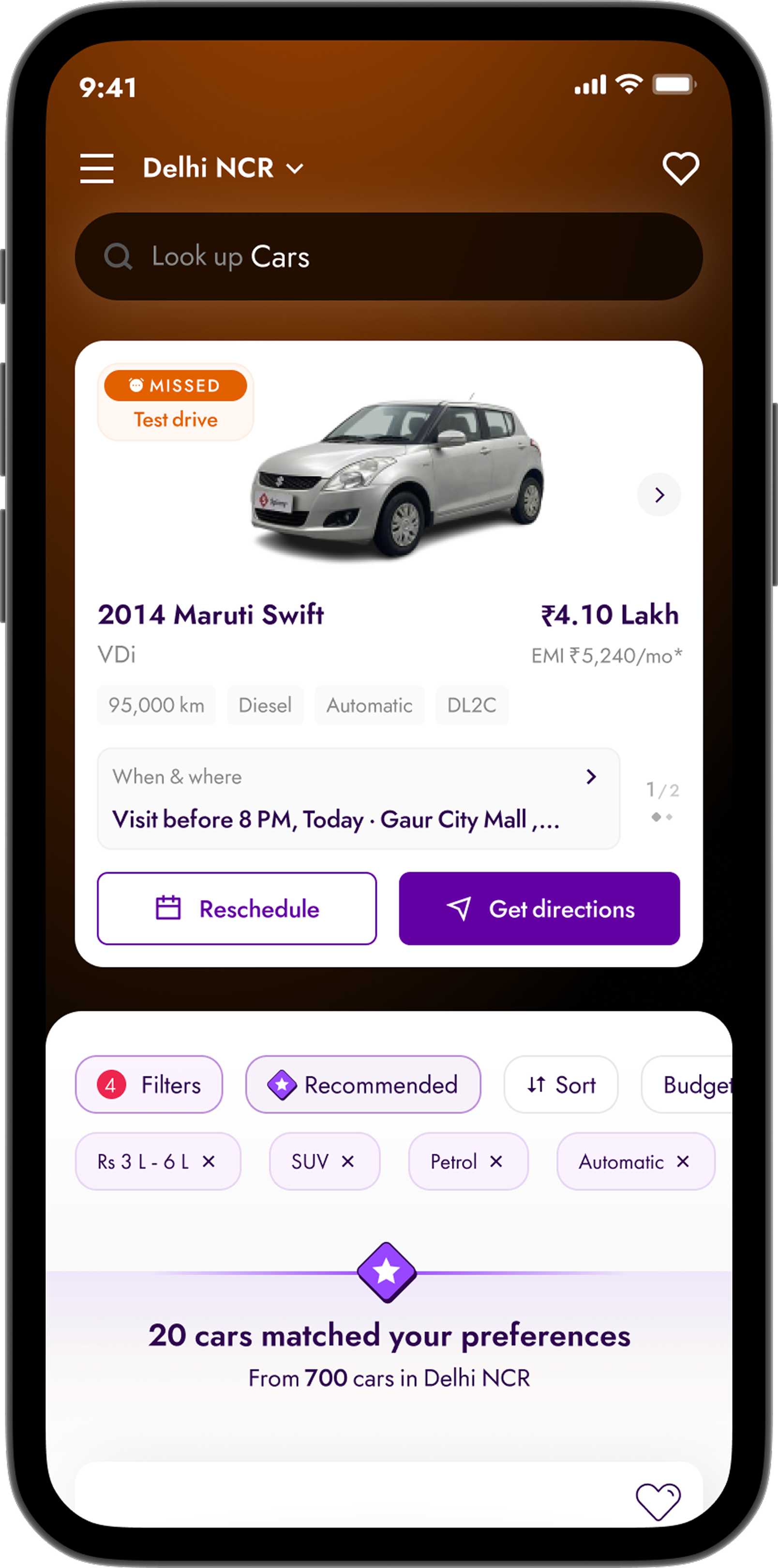
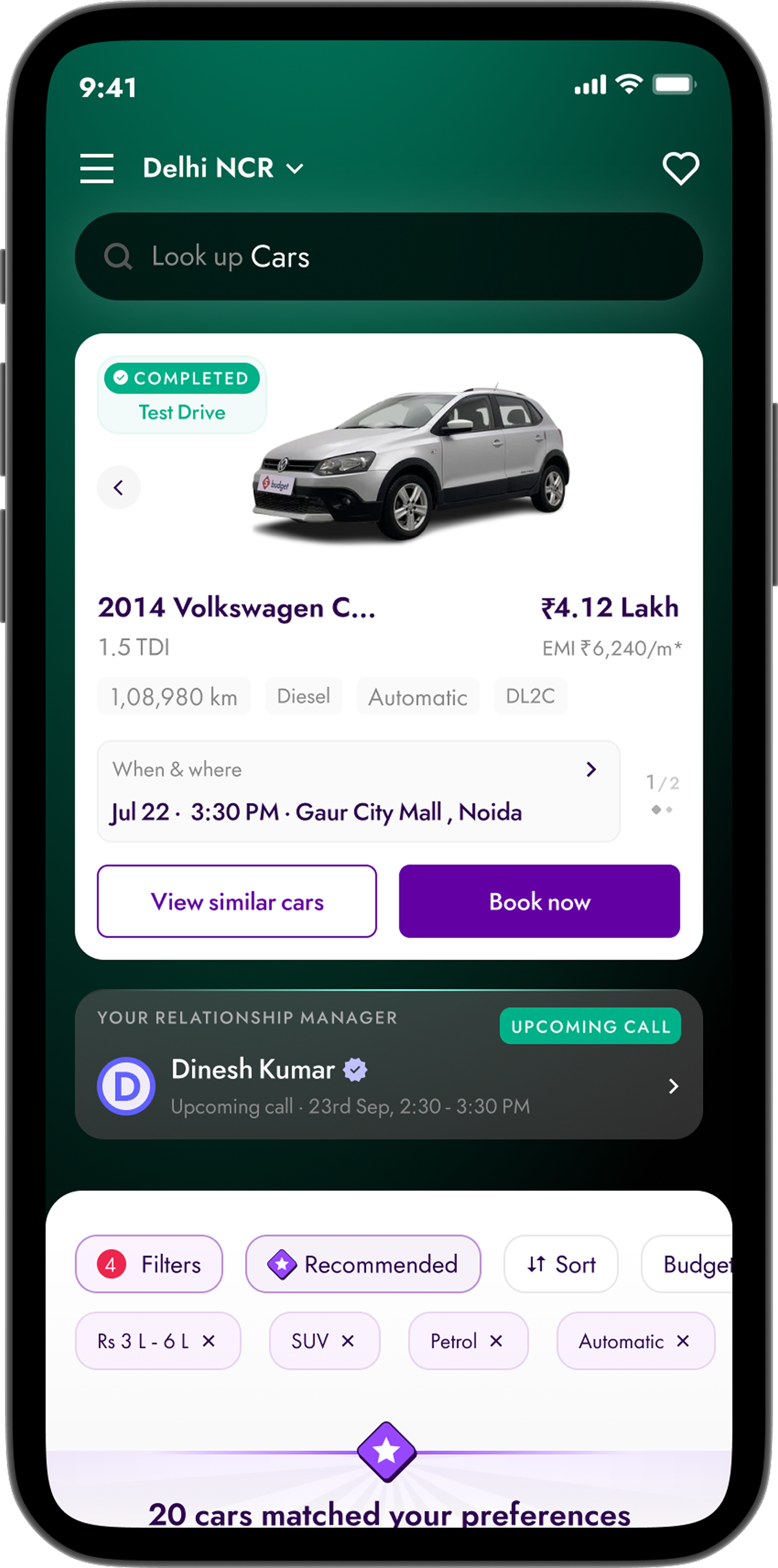
The homepage dynamically adapts based on the user's transaction stage. Exploratory users see the existing browsing experience unchanged. Committed users see their stage and the one action they need to take, surfaced automatically.
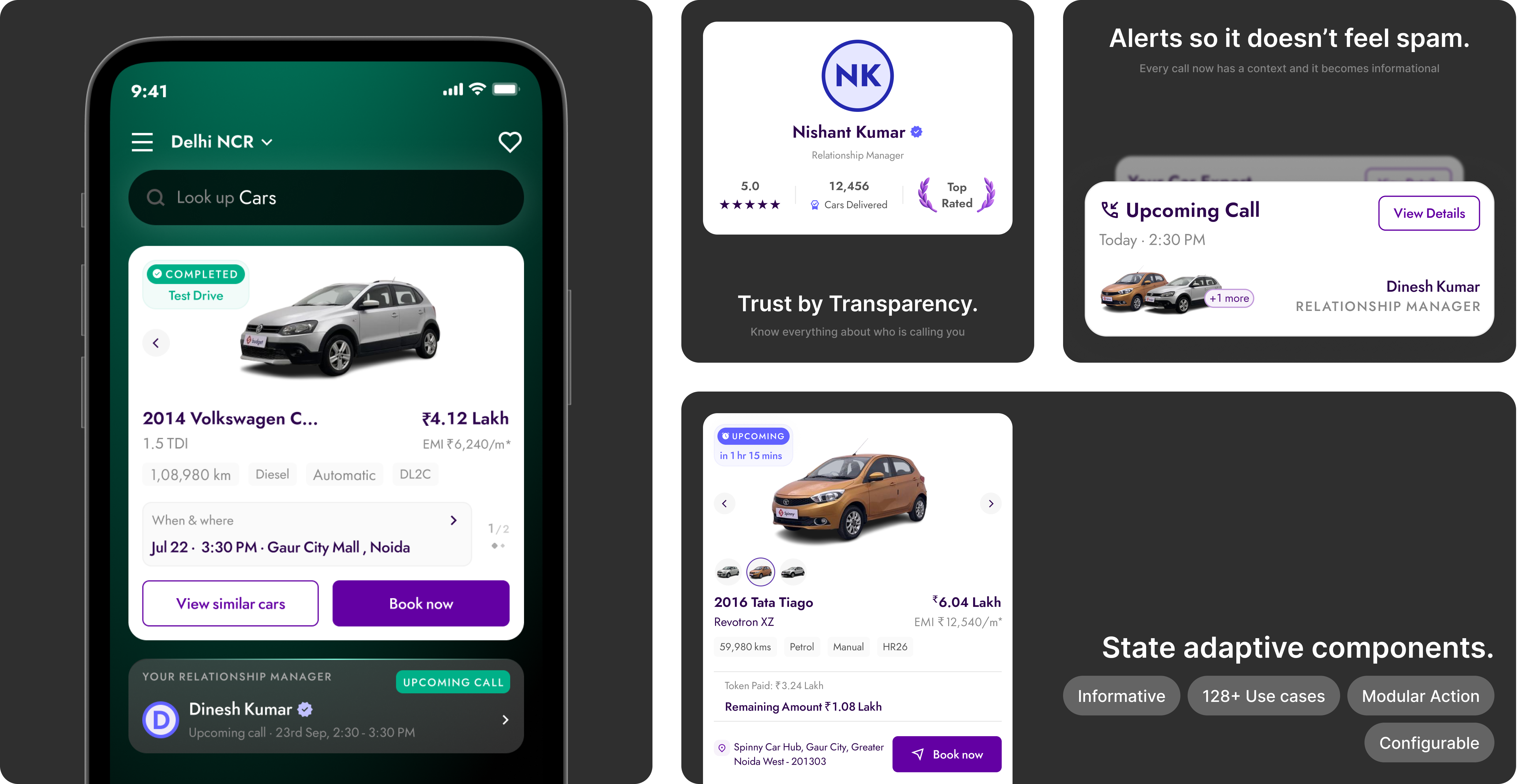
Component library for the state-aware homepage, covers all transaction stages from test drive scheduling through delivery.
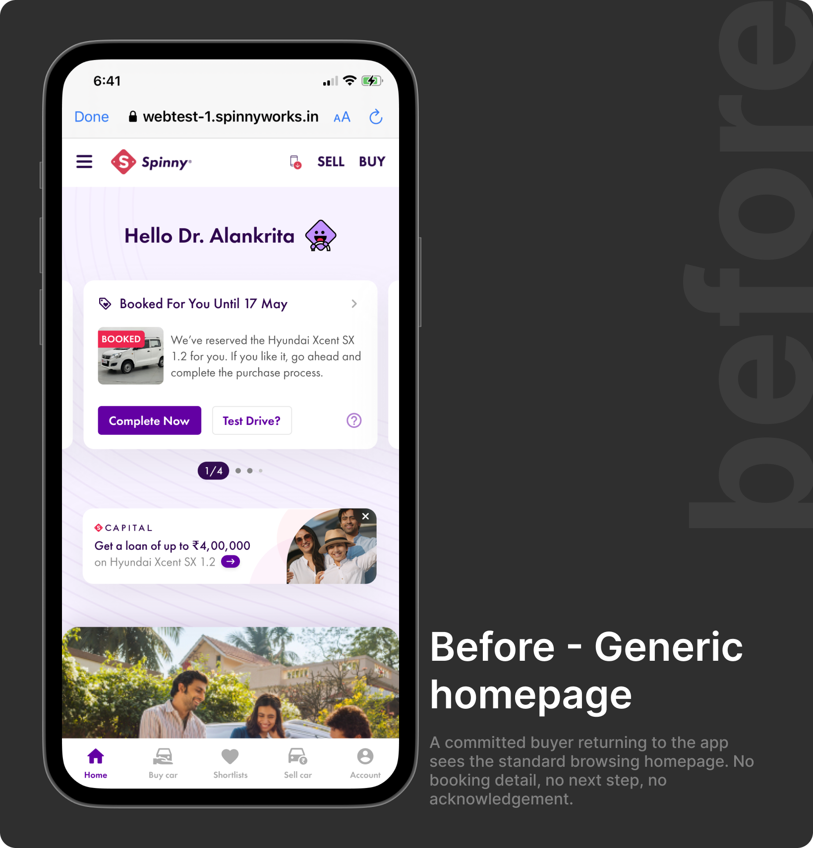
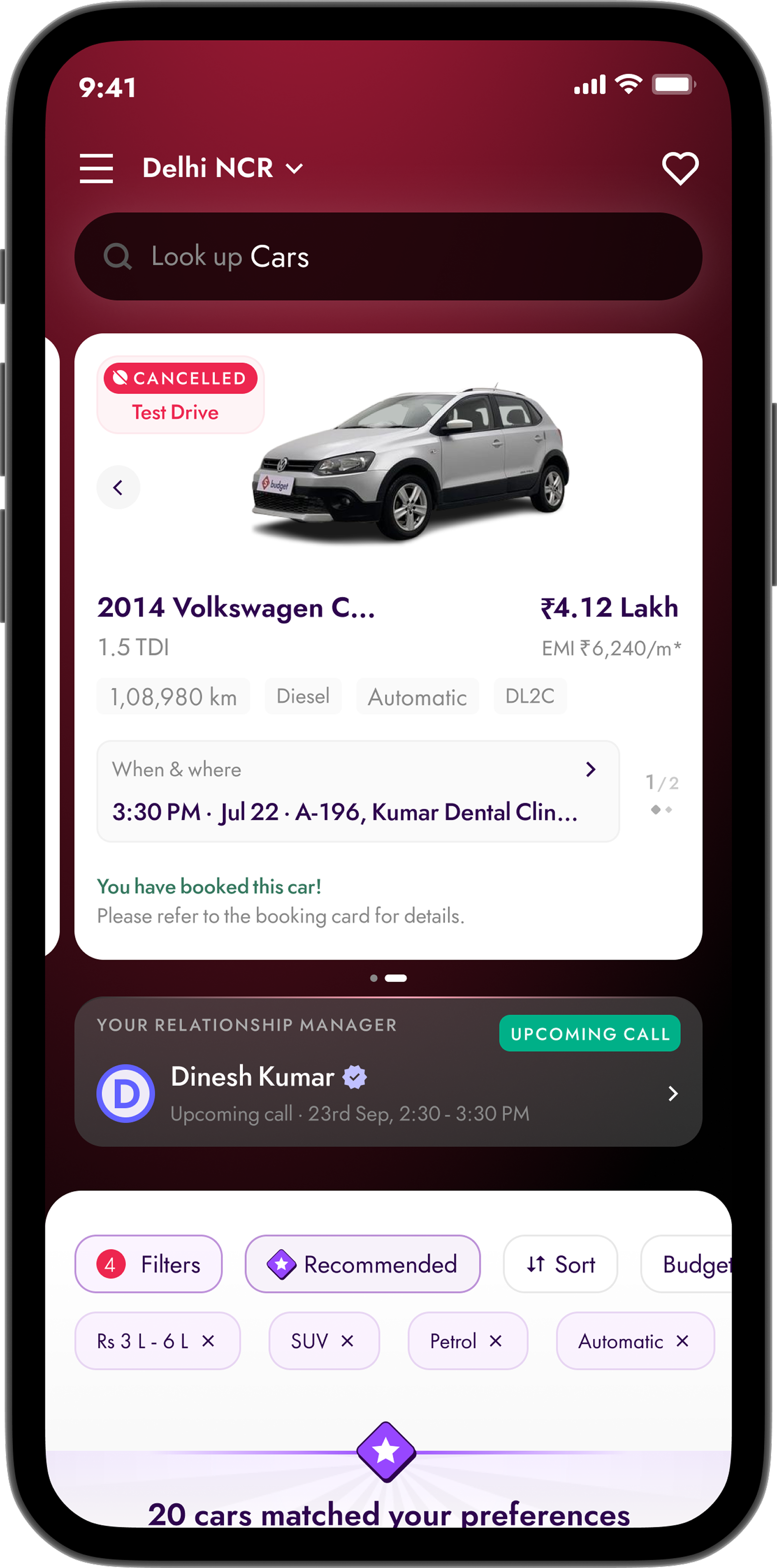
Before, a returning buyer sees the same browsing homepage as a first-time visitor. No booking acknowledgement, no next step.
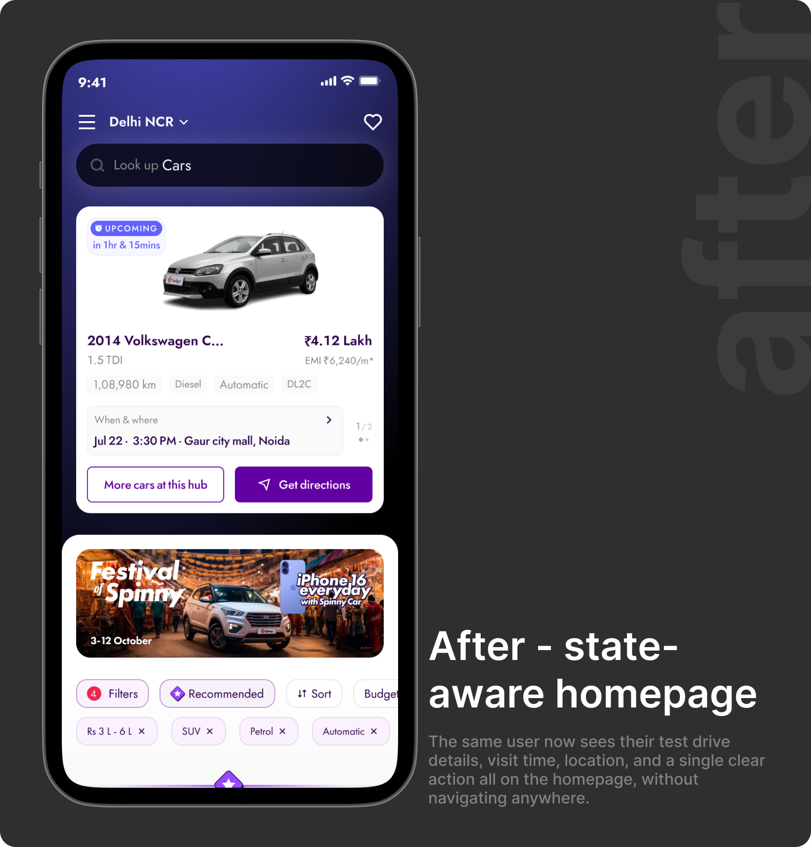
After, the homepage surfaces the user's exact stage, relationship manager details, and one clear next action.
09.
Outcome
By transforming the homepage into a journey-aware experience, active buyers got what they needed, visibility, context, a clear next step. At 2.5M MAU, small percentage improvements compound significantly.
Uplift deepened further in the funnel, a signal this wasn't surface engagement, but a genuine improvement in decision quality among active buyers. All three downstream metrics moved together.
10.
Whatthistaughtme
The most important reframe happened before any design work. We weren't solving a UI problem, we were solving a continuity problem. The homepage didn't need to look different. It needed to know more.
Working within real constraints, team ownership boundaries, performance limits, leadership risk thresholds, sharpened the solution rather than diluting it. The best answer wasn't the most ambitious. It was the one that worked within the system while quietly changing what it could do.
They need the product to remember them.
Read next

