01.
Designingacomparisonfeaturefordecisionspeed
Users comparing cars on Spinny were making a decision the product couldn't see. They bounced between listings, returned to the same cars repeatedly, managed their own tabs. The data had the signal. The product had nothing built for it.
02.
Problem
The A→B→A pattern.
A user doing comparison work the product wouldn't help with.
Behavioural analysis across 238,000 users revealed a pattern: users would visit car A, switch to car B, return to car A, go back to car B. We called it A→B→A. It wasn't indecision , it was a user actively trying to decide without the right tool.
“Users were already comparing. The product just wasn't helping them do it.”
Drop-offs spiked at this exact point. The problem wasn't that users couldn't choose , it was that the product was forcing them to hold two cars in memory simultaneously, across multiple sessions, without any support.
| The Browser | The ComparerThe Gap | |
|---|---|---|
| BEHAVIOUR | Scrolling listings. Saving favourites. Not ready to decide. | Visiting the same 2–3 cars repeatedly. Bouncing between PDPs. |
| GOAL | Find cars worth considering | Pick between cars already in their shortlist |
| PRODUCT OFFERS | Listings, filters, search, serves this user well | The same listings again. No comparison tool. |
| DROP-OFF RISK | Low, still discovering | High, cognitive overload leads to abandonment |
Two user types, one product, the comparer was entirely underserved.
03.
Thedata
I analysed conversion across the 2.3M PDP user base to understand how comparison behaviour correlated with downstream purchase. The signal was unambiguous, and the gap between comparing and non-comparing users widened at every stage of the funnel.
Conversion rates across 2.3M PDP users. Comparing users (n≈238K) vs non-comparing users. A/B validated post-launch.
The gap widens at every stage. By delivery, comparing users convert at 11.6× the rate of non-comparing users. Comparison isn't just a feature request, it's the strongest behavioural predictor of purchase in the dataset.
04.
Designquestion
The HMW moved us from describing a problem to framing a product opportunity. The user wasn't broken, they were doing real decision-making work. We needed to give them a better tool for it. The key constraint: no explicit ‘Compare’ CTA. Adding a visible button would introduce artificial adoption bias. The trigger had to be behavioural.
05.
Workingwithintherealworld
Four constraints shaped what was possible before exploration began.
06.
Twopaths.Onerightanswer.
I explored two structurally distinct approaches. The goal wasn't the most ambitious solution, it was the one that solved the problem without creating new ones. Both were prototyped and reviewed against the same brief: reduce cognitive load at the moment of decision.
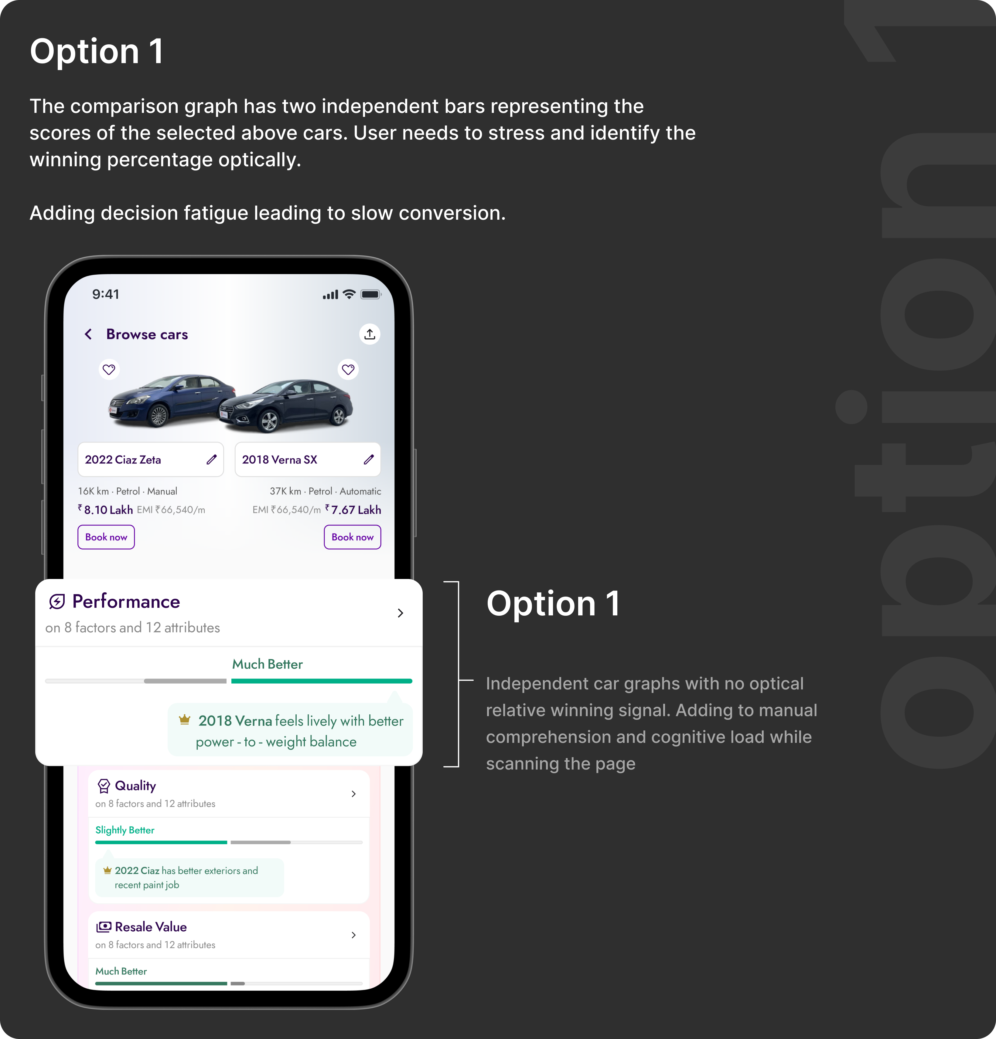
Option 1 reads as data, not decision. Two independent bars give accurate numbers but no relative signal — the user still has to do the mental subtraction. Under time pressure or on a mid-range device, that's exactly where comparison falls apart.
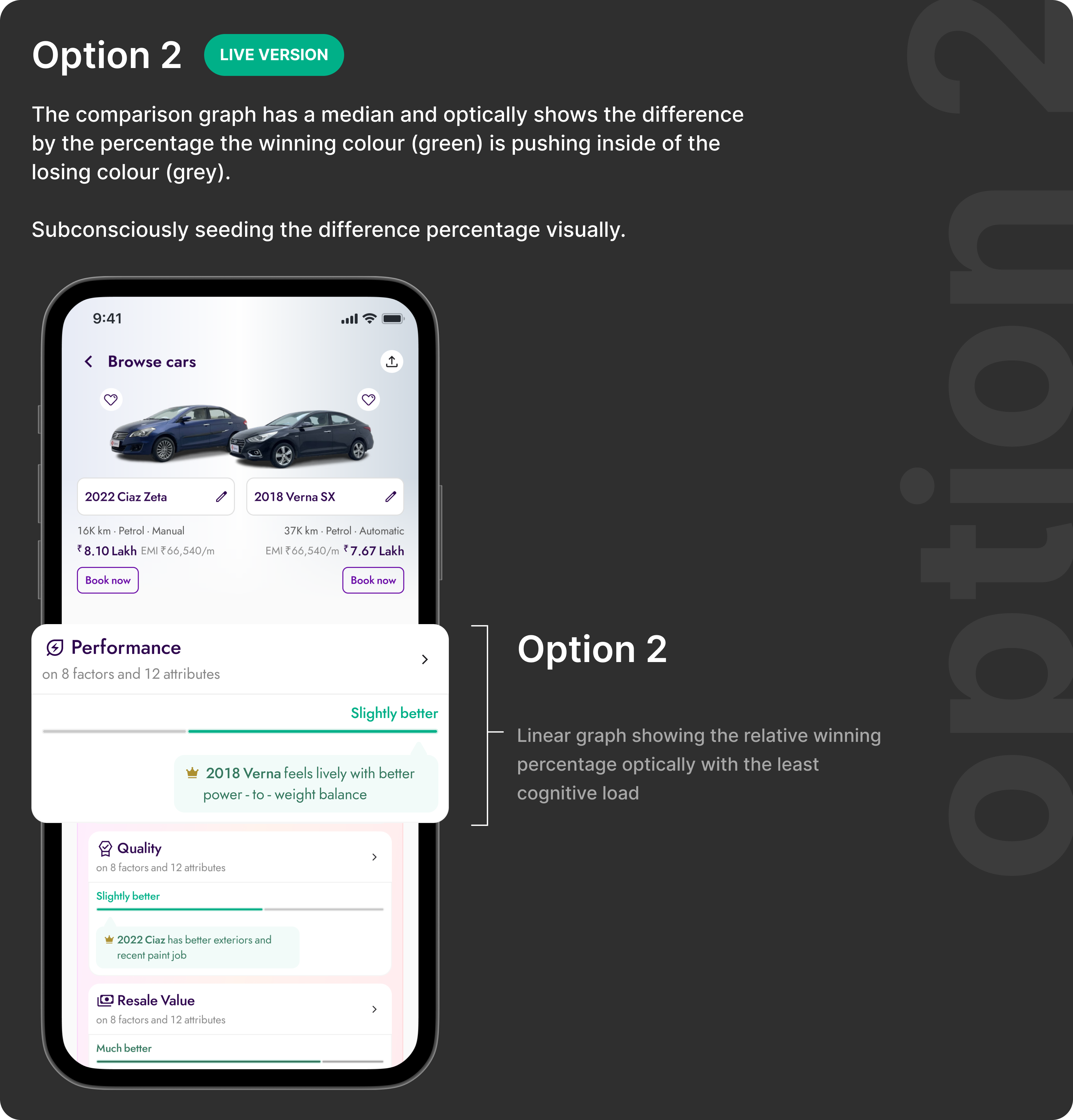
Option 2 · shipped.A single axis makes one car the implicit reference point. The delta reads instantly — no arithmetic, no toggling, no memory. The user's job shifts from “calculate which is better” to “confirm what I already sense.” That shift is the design.
The inline strip checked every functional box but failed on scalability and performance. The dedicated comparison surface, launched from a contextual tray that appears only after the user shows comparison intent, preserved browsing continuity and delivered a focused decision experience. Option 2 was selected for all use cases.
07.
FinalDesigns
The comparison feature surfaces at the exact moment a user shows comparison intent — after visiting multiple PDPs. It doesn't interrupt browsing. It doesn't ask the user to change behaviour. It offers a better tool at the moment they need it, and disappears otherwise. Three screens. One job: close the decision.
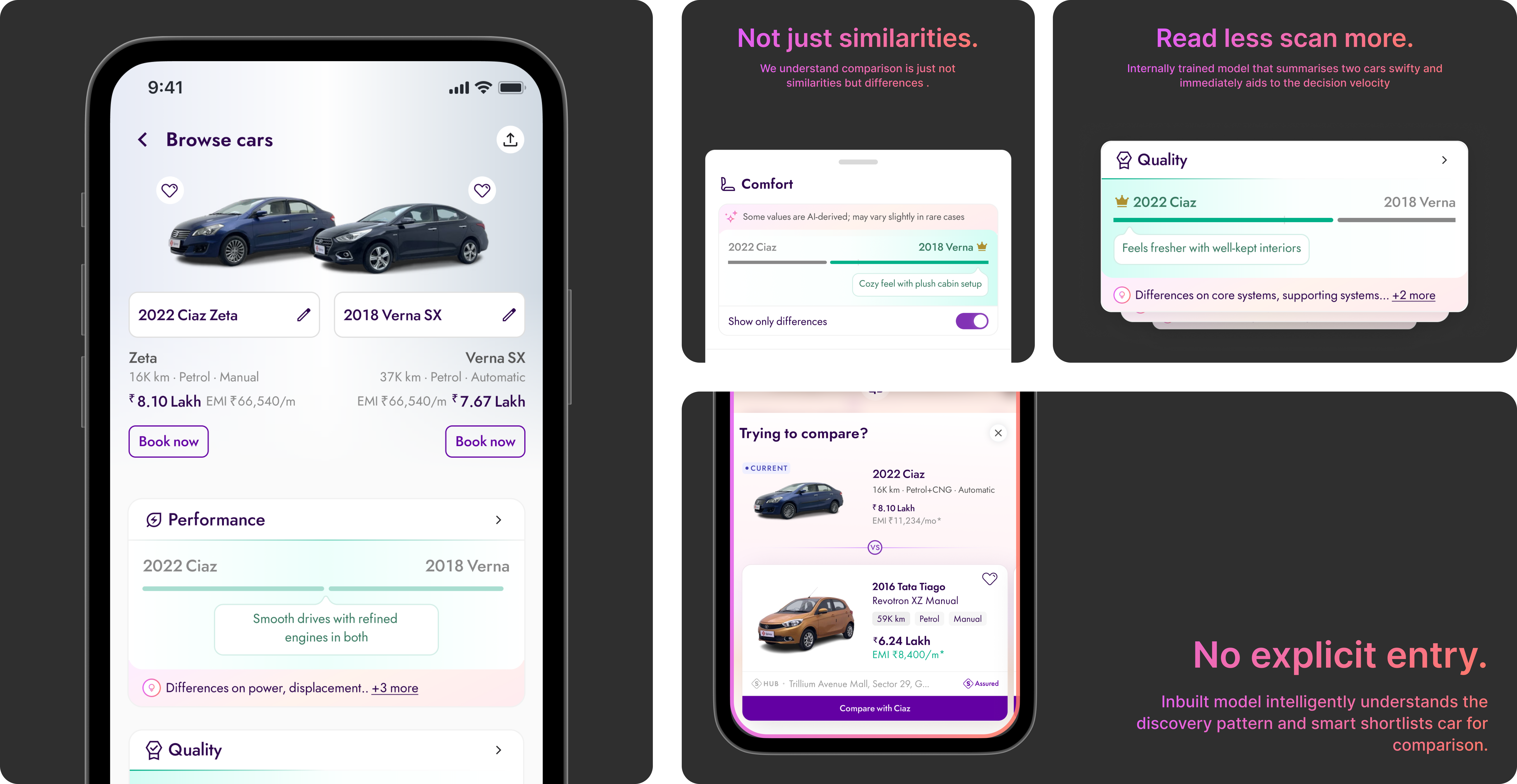
Three screens with a clear hierarchy of jobs: select, compare, decide. Notice that none of these screens introduce unfamiliar UI patterns — the card language is the same as listings, the navigation chrome doesn't change. The only new idea is the difference indicator. Familiar enough to trust, specific enough to act on.
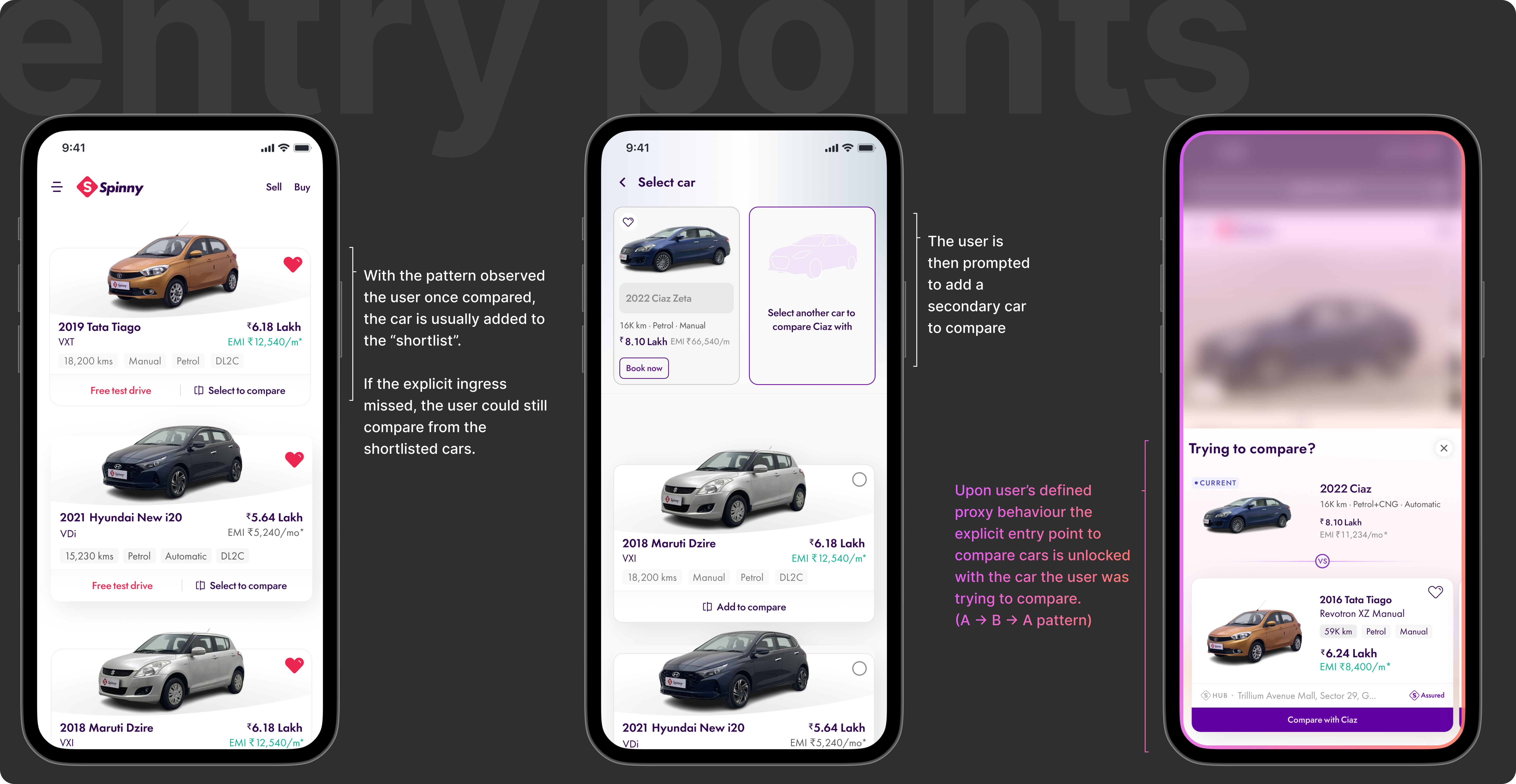
The tray doesn't announce itself. It surfaces when the behaviour says the user is ready — only after the A→B→A pattern fires. There's no CTA to ignore, no modal to dismiss. Timing is the design here. The same interaction, surfaced ten seconds earlier, would have felt like an interruption. Here it feels like the product read your mind.
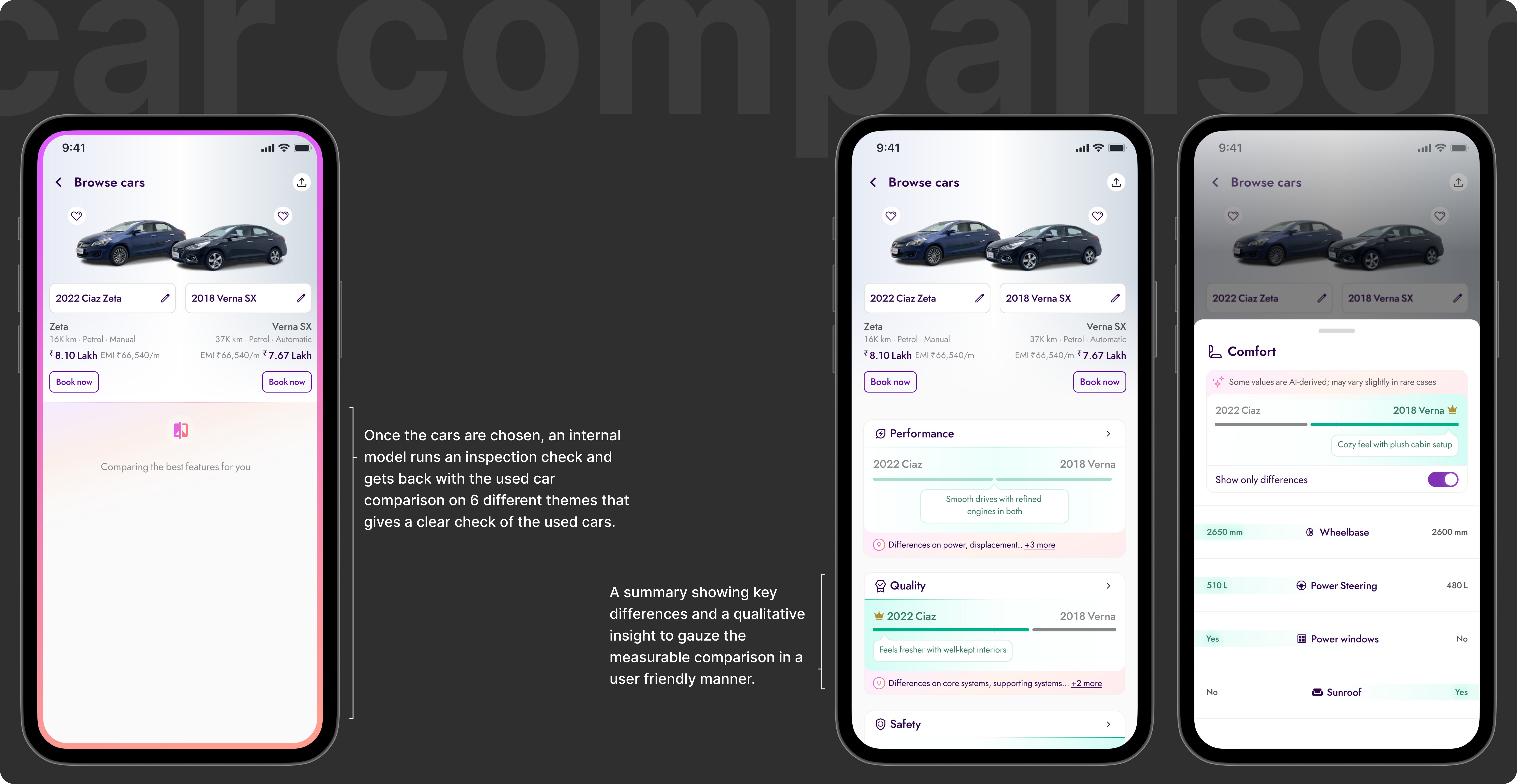
The hardest decision here wasn't the layout — it was what not to show. Grouping by category (comfort, performance, safety) mirrors how buyers think, not how the database stores data. The difference indicator removes the arithmetic entirely. The AI summary at the top collapses the full table into one sentence for the user who's already decided and just needs confirmation. Hierarchy doing the work that scrolling used to do.
08.
Outcome
By giving users a structured way to compare, we shortened the decision cycle and improved downstream conversion at every funnel stage. At 2.3M PDP users, the impact compounded significantly.
09.
Whatthistaughtme
The most important discovery happened in the data before any design work. Users were already comparing. They were doing it manually, at significant cognitive cost. The product just wasn't acknowledging it.
That reframe changed everything. We weren't building a new feature from scratch , we were building the tool users were already trying to use. That's a fundamentally different brief. One where you already know the behaviour works. You just need to make it less effortful.
Working with a clear behavioural signal, the A→B→A pattern, disciplined the design process. Every decision came back to one question: does this make comparison faster and less cognitively demanding? If not, it didn't ship.
They just needed the product to stop making it harder.
Read next

